

Remember, just because the money is spent, it doesn’t mean it is spent well. I’m sure a lot of the US dollars are fed into sports programs and other spending, and not directly towards efforts that would benefit the most students or workers.
Yeah, also salaries are wildly different between these countries. This is a really not apples to apples
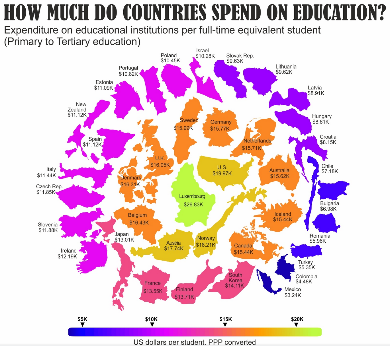
This is PPP (purchasing power parity), so that gap should be corrected at least partially
I’d much rather look a simple sorted table or a bar chart.
For me the country outlines don’t add anything of value and they aren’t too scale either with arbitrary rotations mixed in. Spending is on a strictly one dimensional scale yet the graphic implies some concentric (2-dimensional) pattern.
I agree. Standard bars are boring, and it’s not bad to liven them up, but there are a lot of different ideas layered one over another with a little connection to data representation or increasing readability (also heatmaps with strict color gradations, false grouping, distance from center breaks at the bottom level mixing different colors). But nailing visuals without trying things out is impossible. OP got feedback they can put to use in the future.
Critically checking the graph after each step could’ve make it easier even for them. Had it become better in some way with X? If no, let’s scrap it and try something different.
Israel’s outline is sketchy to say the least…
Canadian average is about 1 or 2 thousand less than that from the last info I could find a few weeks ago

