I’ve been using Adobe’s Source Code Pro for years (which they don’t even mention as an open source monospace font). This looks pretty good, but I am not a fan of the parenthesis () and braces {} they look almost hand-drawn (or perhaps the arc is to harsh or something, IDK).

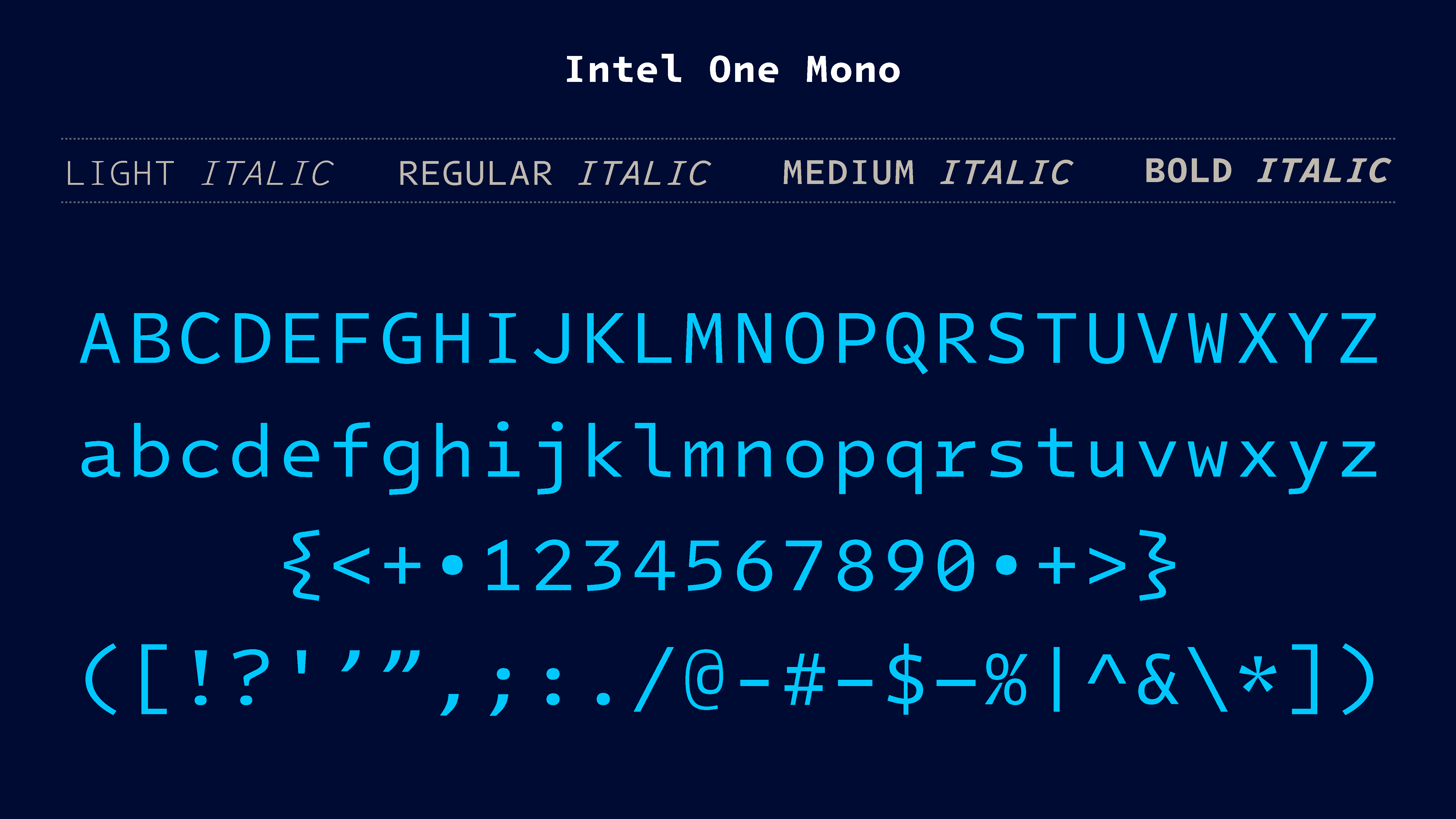
I’ve been using Adobe’s Source Code Pro for years (which they don’t even mention as an open source monospace font). This looks pretty good, but I am not a fan of the parenthesis
()and braces{}they look almost hand-drawn (or perhaps the arc is to harsh or something, IDK).The braces are a bit weird but they should be easier to distinguish at first glance because of it.