

It’s not even more aesthetic. Just more unified in branding.
And the interface of their apps are still incoherent af. I don’t know how, but they manage to make things worse every time
It’s ok, they’ll just retire the service eventually.
Yeah, the old logos were all over the place. At first glance it’s not obvious they’re all Google apps.
And? All of those being part of the same walled garden is a bug in the legal system not a feature.
Better be explicit about the walled garden rather than being diffuse about it
To me, that’s just the case for camera and calendar. Maps is IMHO perfect (except the unnecessary G) and the red-and-white envelope is quite well-known.
I think what really bothers me about the aesthetics is that the shapes are broken up by the coloration. For example, the pin icon for Google Maps looks almost like a hook, because the yellow has little contrast on this white background.
And that’s why I don’t really hate it. I hate Google, but I think it’s a neat design choice. I still hate Microsoft’s icon design a lot though, they can’t seem to stick with one thing.
Whatever. It sucks ass is the point.
My point is that it’s also ugly.
I definitely find it more aesthetically pleasing. Just like the icon packs.
i think they did need to unify the design and branding but i also agree they went too far with it. if they had only chosen 1-2 colors for each app icon that would have helped a lot.
gmail - red
drive - yellow
maps - green
meet - blue
calendar - lighter blue
problem solved
Problem solved! If we ignore the world’s ~300 million colorblind people.
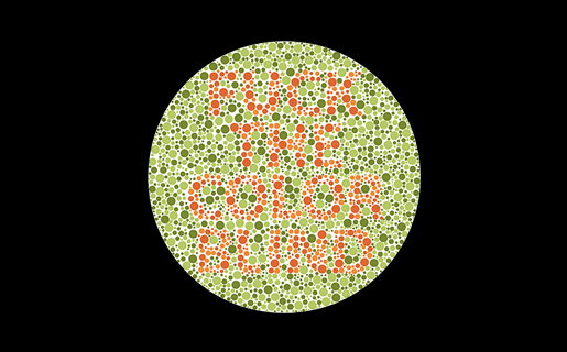
is that the one that says “fuck the color blind” because if so hey!! that’s not nice
Hey, color blind people deserve sex, too!
No way dude, it’s the other one that says, “we love the color blind.” Really.
Beat me to it.
i think they forgot to mention: they’re not all the same shape.
True. Colorblind people come in all shapes and sizes.
Ah, the old Lemmy shapearoo
Worked for a few jumps but then it sent me to kbin with a 50x error 🤷
Edited my comment with a different link, should be a bit longer now
Hold my shape, I’m going in!
oh no not again
Except that the original post was contesting that those shapes are indistinguishable from each other. My point, therefore, is that the solution offered in the post I replied to would still be indistinguishable to 300 million people.
the squares are there for comedic effect. the shapes are not actually indistinguishable. but at a glance, color is a much faster tool we use to identify these icons. so the problem here is that it takes longer for us to decipher a Google app icon, and the solution would be to differentiate the colors.
also this would help colorblind people as well, because removing unnecessarily complicated colors would make the shapes easier to identify as well.
Yes I understand the meme and I’m not trying to get into an argument. I’m just trying to educate as to why relying on color as the primary differentiator is not a solution to the problem as proposed.
at a glance, color is a much faster tool we use to identify these icons
Think about what you’re saying here, and consider how ridiculous it would sound if you said that to someone who was completely blind.
Sure, to a “color normal” person, something’s color is a great differentiator, but even when using a colorblind friendly pallette it’s just far easier for us to distinguish different shapes than colors. We’ve spent our whole lives adapting to a lack of color information so asking us to be able to work purely on color alone is like asking a blind person to see.
Again, and this part is really important and oft overlooked - this applies even when a designer has gone out of their way to choose a colorblind friendly pallette. It’s just not that easy for us. I honestly couldn’t even tell you what Google’s corporate pallette is without looking and I’m sure that information is second nature to normies.
this image has two groups:
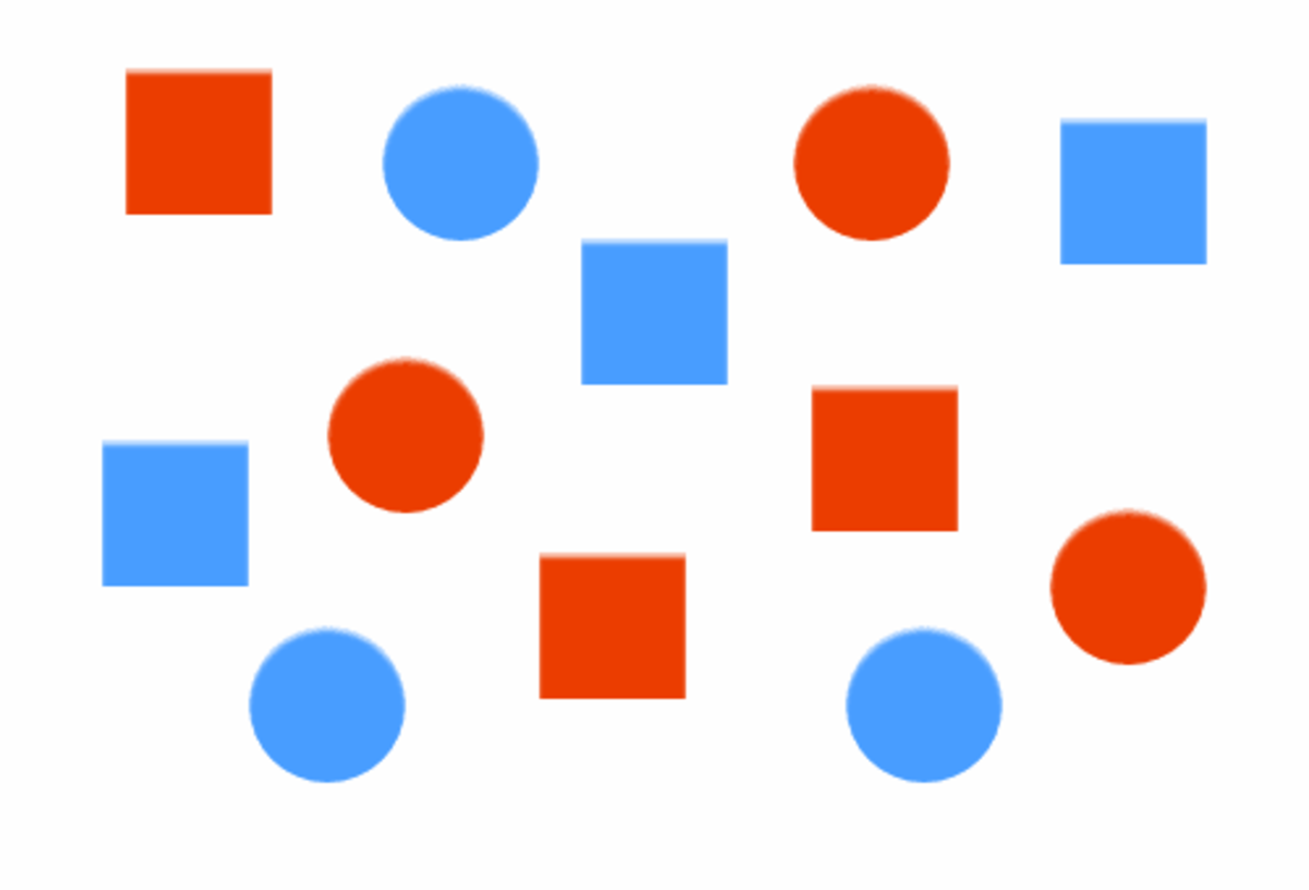
at first glance did you separate it into red v blue or circles vs squares?
you’re absolutely making things up. we’ve evolved to differentiate shades as well, which supercedes colors. even for colorblind people this kind of image should be differentiated by color or shade first.
not to mention not all people have perfect vision, in fact people with blurry vision probably outnumber colorblind people, and that would make the shapes not extremely reliable, especially when most icons would be more or less squares and circles with small details changed.
you’re absolutely making things up
I could tell you what I see but you wouldn’t believe me anyway.
I was trying to show that not everyone perceives the world around them in the same way, and most people find it fascinating when they take a step back to really think about it. But you’ve already decided that simply not being able to see colors in the same way as you makes me inherently wrong, so I’m not going to engage any further.
The icoms would still have different shapes, right?
No, it would just be the 🤣 emoji in different colors.
Which is how they are now
Yes, but the original post is suggesting that they’re ambiguous enough to all be squares. Running with that concept, making a bunch of squares different colors doesn’t fix the issue for those of us who can’t easily identify those colors.
Most software pretty much doesn’t give a fuck about the visually impaired despite everyone talking big shit about accessibility. So I could certainly give a fuck what color someone’s logo is.
then what is your solution? do you expect them to redo their entire corporate branding palette?
Nope. The icons are honestly good enough as they are, but the original post was being disingenuous in suggesting they’re no more distinguishable than squares.
Running with that logic, having each square a different color does not solve the problem for those of us who can’t easily distinguish those colors.
it’s a meme, so obviously it’s hyperbolic. but the point is valid.
calendar - lighter blue
It’s called goluboy. In Russian at least.
I wouldn’t even call this “aesthetics”. Rather “conceptual homogeneity” or something like that. It’s what happens when you strive for a uniform look over a useful or visually pleasing one.
Even uniformity can be aesthetically pleasing, but these icons are decidedly not.
In some countries uniform look at least provided good for society. In this case it provides only profits for to 1%.
Good for society:
The homogenization of these icons has been a long source of consternation for me.
They’re barely functional as icons; you can scroll right by them and miss them; which makes finding the apps in a list of apps a bit annoying sometimes. Removing each icon’s unique color scheme and replacing it with the ‘company 4 colors’ was the stupidest fucking idea ever.
Even more infuriating is how they keep renaming the applications to unexpected things every so often; so they move around; and it’s dreadfully annoying to remember if they prefixed the name of the app with a G or something else completely different, which renders strict alphabetical sorting a bit moot.
It can get even worse. My phone lets me do this to my icons which is ridiculous. I think this was opt-in but now that I’m going through my settings again I can’t actually figure out how to turn it off lol
Long press the homescreen, wallpaper and style, themed icons
This is Material You icons; and this is basically not something you can opt out of…that I know of. You may want to find a different Launcher that allows you to load icon packs or disable that Material You behavior. (If yours doesn’t)
Just had to comment on your elegance and class good sir. Carry on!
Pardon; but I do happen to be a lady; thank you.
Just had to comment on your elegance and class good
sirma’am. Carry on!Yikes with the down votes sheesh. Some redditors snuck through!
I keep all my Google icons quarantined in one folder. Case in point:

I use nova launcher. It allows you to replace any app icon by any png file. So you can download the old icons from the internet and use them on your phone. It’s a lot of work and I agree Google shouldn’t have done this, but at least you can revert it if you want to put in the effort.
I also use Nova Launcher and had no idea you could do that! Thanks for letting me know.
Lol at the Photos icon. How does that in any way represent a photo or a camera? I guess it’s an iris shutter but that’s not something you notice too often on a real-life camera.
I think it was flower at some point.
I thought it was a shutter
Yea, it’s abstracted but based on aperture blades of the shutter.
I think it’s kinda morphed into a pinwheel, which still sorta makes sense as pinwheels have been a staple of photo and camera advertising for their bright colours and rapid movement.
Yea. I can’t actually recall the icons before the rebranding.
I can’t find photos on my phone without reading and I couldn’t find it in there either. I always click camera then go to photos from there.
Ugh… feels dirty to even have most of those apps installed.
Of those I have Gmail, Translate, and YouTube. I would get rid of those if got decent iOS alternatives.
Yep, same here
Plus the art they started using in gdrive. The art on its own is cool but within the Google ecosystem just feels like… what is it even… why… ugh I hate it.

Corporate Memphis. It’s an art style a lot of people hate, and I can understand why.
soulless corps trying to seem friendly, that’s why
I’ve recognized this style as a generic corpo art, but never had a name to put to it. Thanks for that.
Sanitized, pandering, and insincere, Wikipedia describes it perfectly.
Yeah like in 50 years I can absolutely imagine people loving it as a style of a time. I recognize I like pop art far more than I would if I was in its target demographic. But also I don’t hate it, it’s just so everywhere and so soulless. It’s the style of “money please” in a time of great socioeconomic inequality. It’s art deco but demanding friendship and comfort rather than respect and awe. But more than anything it’s art for business people, and I just don’t care for business people.
Corporate Memphis
Link for the lazy: https://en.wikipedia.org/wiki/Corporate_Memphis
I am actually quite fond of this style, though this might be controversial
prevent body shaming by only showing obese/disfigured people so society accepts it as a healthy norm
Corporate memphis does incorporate a sort of identity vagueness.
Almost all human features, body, skincolor are in a uncanny valley. Non-personal enough to be general yet similar enough to be relatable to pretty much any theoretical demographic.
In reality it falls flat. Many people (non partisan) dislike it because of how artificial and shallow it feels.
What it is definitely not is a deep plot to change the social perception of checks note people with non idealistic body features.
Google has no economic incentive to improve your opinion of disabled people who are equally part of this group you appear to find non acceptable to exist in the workforce.
Google has no economic insensitive
“Economic incentive”, right?
My english is self taught, i’ll take your word for it! (Pun intended)
Ah in that case insensitive (in+sensitive) is a synonym to rude. Incentive is closer to reward.
Slow down there, Dr. Gall…
Triumph of visual design over interactive design. These days, most “designers” only care about graphics visually. The much deeper science of how people use and understand things is beyond them. Worse, they think the problem is that everybody else does not “get” visual design.
Style over substance.
Case in point: Every single thing Microsoft is doing in Windows these days.
Worse, they think the problem is that everybody else does not “get” visual design.
This means they didn’t even make good design. Another example is KDE vs GNOME.
KDE: “We just did system we wanted.”
GNOME: “No, you don’t get it, this is design!”
[It could be sooo easy to solve, but noooo…

Without the distracting colors, now I can see this says MAPOD
People simultaneously justifying their jobs but not willing to make significant, meaningful changes
Since Gmail doesn’t have the obvoious envelope anymore I often open it when I want to open Maps. My brain ist like “M for Maps”.
Anyone else this there’s actually nothing at all wrong with the “New” row of icons? Except for the triangle one, which is terrible in its “Original” version as well, as it indicates absolutely nothing about its app (I believe it’s Google Drive, right?). All the rest are clearly distinguishable, and have relevance to what the app does.
The Google drive logo is even worse when you compare it to the play store logo which is also a triangle. I mix them up all the time
I’m mad that the Gmail icon is no longer an envelope, but other than that they’re fine.
Not Google related, but whoever decide that the best color scheme for an Office suite should be light grey text on a white background deserves to be flogged.
What would happen if people deserted Google products in droves?
Mail:
- Vivaldi mail
- Android client: K-9 Mail
- Desktop client: Betterbird
Cloud:
- Mega [referral URL]
Maps:
Meet:
Calendar:
- Vivaldi calendar, syncable with a myriad of clients.
Here’s an exhaustive list of Mostly excellent “free” software that I use.
Please also consider supporting the myriad of developers who offer their superior products for free, open source, without ads.
“What if I paid for all my free software?
I’ve always felt guilty by taking for granted the rare breed of virtuous humans that provide free excellent software without relying on advertising. Let’s change that and pay, how much would I “lose” anyway?” —https://www.cynicusrex.com/file/takemymoney.htmlMatrix is general-purpose chat. Meet will be replaced with Jitsi.
Also why not nextcloud for storage on someone else’s computer.
Not a fan of Vivaldi, but that’s the spirit.
Why not use Keybase for cloud and proton for mail?
I dropped all their services as soon as Proton promoted crypto"currencies", i.e., multi-level marketing pyramid schemes.
Haven’t tried Keybase yet.Do you disagree with their reason?
Responsible financial diversification requires holding some assets outside of the traditional government controlled banking system.
They didn’t say they were going all in. They aren’t continuously promoting - at least not that I’m aware. They were just being open and honest about how they’re handling their finances.
”Do you disagree with their reason?
Responsible financial diversification requires holding some assets outside of the traditional government controlled banking system.
They didn’t say they were going all in. They aren’t continuously promoting - at least not that I’m aware. They were just being open and honest about how they’re handling their finances.”
I absolutely disagree.
- “Responsible” and “Bitcoin” is an oxymoron due to the inherent multi-level marketing pyramid/Ponzi scheme aspect of crypto“currencies”.
- “Money corrupts; bitcoin corrupts absolutely.
Disregarding all of bitcoin’s shortcomings, a financial instrument that brings out the worst in people—greed—won’t change the world for the better.” —https://www.cynicusrex.com/file/cryptocultscience.html
“Responsible” and “Bitcoin” is an oxymoron due to the inherent multi-level marketing pyramid/Ponzi scheme aspect of crypto“currencies”.
First, you’re removing the next two words “financial diversification” from the statement. Your own personal opinions and emotions aside, financial diversification is not a bad idea. It’s all about percentages and risk calculations. I would agree with you if they went “all in” on crypto, but they didn’t say that.
Second, you’re lumping in bad people with good tech that has solved a very specific problem - the ability to transfer funds without relying on a central bank or authority. Is email bad because the majority is spam? No. Is the internet bad because the dark web exists and thousands if not millions of crimes are being carried out on it? No. Are encrypted messengers bad because they allow criminals to send message? No. Same concept here. There can exist a good technology that gets abused by bad people.
“Money corrupts; bitcoin corrupts absolutely.
You can stop at “money corrupts”. bitcoin is money and money corrupts.
Disregarding all of bitcoin’s shortcomings, a financial instrument that brings out the worst in people—greed—won’t change the world for the better.”
Disregarding all of the U.S. Dollar’s shortcomings[1], a financial instrument that brings out the worst in people—greed—won’t change the world for the better.”
Fixed it for you.
[1] The US spent 877 BILLION dollars on its defense budget (as much as the next 10 countries combined!) to ensure the USD keeps its power.
“Responsible” and “Bitcoin” is an oxymoron due to the inherent multi-level marketing pyramid/Ponzi scheme aspect of crypto“currencies”.
First, you’re removing the next two words “financial diversification” from the statement. Your own personal opinions and emotions aside, financial diversification is not a bad idea. It’s all about percentages and risk calculations. I would agree with you if they went “all in” on crypto, but they didn’t say that.
Gambling or buying into a pyramid scheme doesn’t belong to the category of financial diversification, let alone responsible financial diversification. Responsible financial diversification is investing in skills, property, purchasing cooperatives, official/institutional crowdfunding projects with sustainability in mind—not purely profit, ethical index funds, et cetera.
Second, you’re lumping in bad people with good tech that has solved a very specific problem - the ability to transfer funds without relying on a central bank or authority. Is email bad because the majority is spam? No. Is the internet bad because the dark web exists and thousands if not millions of crimes are being carried out on it? No. Are encrypted messengers bad because they allow criminals to send message? No. Same concept here. There can exist a good technology that gets abused by bad people.
All whataboutism fallacies. Crypto“currencies” incentivize greed. Not so for email, the Internet, messengers, et cetera. The only legitimate usecase for these alternative currencies is financing whistleblowers, journalists, individuals who have to break unethical laws and are therefore disconnected from the banking system.
“Money corrupts; bitcoin corrupts absolutely.
You can stop at “money corrupts”. bitcoin is money and money corrupts.
Bitcoin more so because of its multi-level marketing / pyramid scheme aspect. When one buys USD or EUR one doesn’t try convincing their peers to buy it too so their own wealth goes up.
Disregarding all of bitcoin’s shortcomings, a financial instrument that brings out the worst in people—greed—won’t change the world for the better.”
Disregarding all of the U.S. Dollar’s shortcomings[1], a financial instrument that brings out the worst in people—greed—won’t change the world for the better.”
Fixed it for you.
[1] The US spent 877 BILLION dollars on its defense budget (as much as the next 10 countries combined!) to ensure the USD keeps its power.
Whataboutism fallacy again.
agree to disagree
Mega is shit
Sorry but no, MEGA is good. It’s consistently rated among the best for privacy, performance and price. Imho Proton Drive is the best and most promising though.
Good if you use mega as your main cloud drive but bad for anyone else who got capped at 5gb and have to download inside the browser or use their app
I actually think these are fine. If I can quickly recognise each on my homescreen (I don’t use labels) then it’s fine, and I’ve never had a problem with any of these.
I like it because each company each has its own set of apps, and they have somewhat unified app icons.
Proton is the same, which similar icons as google but with their own unified branding.
I like it, personally.
What I see:
💩 💩 💩 💩 💩


